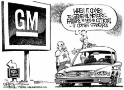
What is the scale of the issue?
- Srivastava, 2014
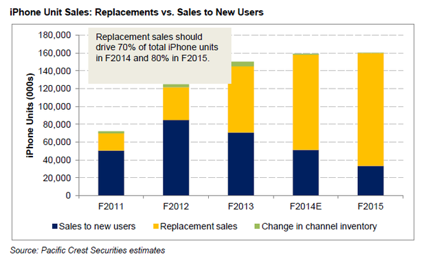
This statistical graph, made in 2014 by Bhavya Srivastava, shows the number of iPhone sales to new users and the number of iPhone replacement sales from 2011 to 2015. It is clear that the number of iPhone replacement sales is rising drastically, whereas the number of sales to new users is falling. This shows that, after the sudden boom of new customers in 2012, iPhone sales have been mostly to people who already have iPhones, and not as much to people who have never owned one. Also, the intervals between the data is one year, meaning that it takes just one year for the iPhone to need replacing. It is clear that this graph was made to highlight the fact that people are having to keep replacing their iPhones due to planned obsolescence, and this is where Apple get most of their profit.
- Singh, 2014
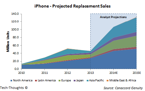
This statistical graph, made in 2014 by Sameer Singh, shows iPhone replacement sales worldwide, and what they are estimated to be in the future. It is clear that North America is contributing heavily to the number of replacement sales, followed by Asia Pacific, with the Middle East and Africa contributing the least. The graph shows a projected rise in replacement sales worldwide, going from 40.0 million in 2013 to 130.0 million in 2015. This graph was clearly made to illustrate the rising levels of iPhone replacement sales, which is estimated to rise 60.0 million in just one year, illustrating that planned obsolescence is a big issue in iPhones.

- Garland, 2009
This statistical graph, made in 2009 by Jack Garland, shows how clothing waste is being disposed of in the UK. The graph shows that 63% of UK clothing waste in 2006 ended up as landfill, 21% ended up unaccounted for or in the national wardrobe, and 16% was recovered. The graph was clearly made to illustrate the issue that the majority of clothing waste is sent to landfills, which is very bad for the environment.


(This last one has been cut up into sections as the original image was too big)
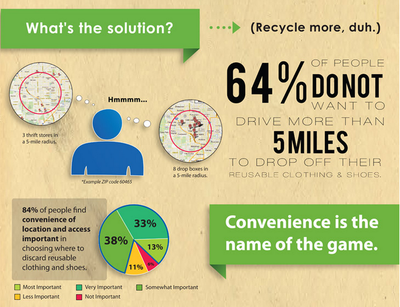
This statistical infographic, made in 2012 by Ecouterre, shows fashion waste statistics worldwide. The infographic shows that barely any of the textiles thrown out is year is reused or recycled, and that a lot of what we throw out is still perfectly useable. It shows how much is wasted in making the clothes we throw away and the environmental impact of throwing away these items. The infographic was clearly made to alert to people the damage we are doing by throwing away perfectly good textiles.
How is the issue being resolved?
